This occasional series goes behind the scenes of the bookmaking process.
We tell children not to judge books by their covers. But when it comes to actual books, first impressions are crucial. Behrman House Art Director Ann D. Koffsky and Executive Editor Dena Neusner describe what they see when reviewing a cover for Welcome to the Seder: A Haggadah for Everyone, coming in 2018, and how it reached its final, beautiful design. (Design by Zahava Bogner)
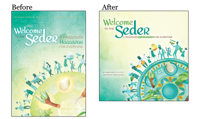
Overall
We want to convey a sense of "everyone" and reflect the diversity of the Jewish experience and of the people at a seder table. When I look at both covers, I really appreciate how all the people are the same color palette of blues and grays, and none of them are genuine flesh colors, so the blue symbolizes a universality. No character in this image is white, black, or Hispanic. Yet there is variety within the blue tones, so we know they aren’t all the same. Everyone is everything. It gets across the message that the book is for everyone. - AK
Background
What's not working in the Before design is the texture on texture. The round seder plate is on a textured background, and there's not enough contrast. It's a light plate on a light background. We changed the background and the plate a lot so now the background goes from light to dark. We achieved contrast through color, not texture. -AK
Art
In the Before design, it's not clear instantly that we're looking at a seder plate. We looked for ways to address that, such as adding mosaics to the plate, and making the seder plate narrower and the items on it a bit smaller to show more of them. Also, it's very hard to read the Hebrew word Pesach on the seder plate. The designer moved it to the rim of the plate and contrasted the color more to make it readable. -DN
There is a woman carrying large palm branches in the earlier version because we considered using Christian imagery to convey an openness to welcoming people of other faiths. We reconsidered, realizing that the cover can welcome others without using that imagery. So now there's a woman carrying an orange tray of food. - AK
The earlier version also shows a man on the far right holding a platter of four wine glasses. But every time I looked at it, I saw a menorah - wrong holiday! So we asked the artist to revise it and she took off the stem from the platter. -DN
In the Before, the objects on the seder plate looked painted on, so we added subtle shadows behind the objects to make them appear as if they are on a plate. -AK
Color
The color palette in the After version is much brighter. The objects the people are carrying are not highlighted. This pops the color but keeps the racial neutrality. - AK
When I look at the Before version, I notice that we need to make the people stand out from the plate. We punched up the color for emphasis, so all the objects the people are holding are in color. Also, the colors really complement each other now. -DN
Type
The font in "Welcome to the Seder" has flair, fun serifs, and feels contemporary but still formal. That's what we want for a haggadah. Passover is a serious thing, and this lettering conveys that it's important but not stiff. - AK
I look at how readable the type is, relative to the art. There's a higher ratio of art to type in books for kids. Here, we wanted the type to be bigger and fill more of the cover so you can read it from afar, like on a bookstore shelf. -DN
In the Before design, the title and subtitle look like separated blocks of text. You could almost draw a vertical line betwen the text blocks. The author and artist names are at the top, like a movie ad. We asked the designer to play with making the title and subtitle more unified. In the After version, they work as one unit. Also, Welcome and Haggadah share a color, emphasizing they are one unit. -AK
The subtitle was also hard to read in the Before version because it's set against a blue background. - DN
Format
We originally planned for the haggadah to be 8x10 and the Before cover was designed for that size. But after a lot of thought, we changed it to 9x9. It's a less traditional size and format and has more of an arty feel, which we felt was appropriate for the gorgeous art by Rinat Gilboa. Also it's square shape could echo the shape of a matzah. -DN