That’s a tough question. It’s like saying what makes a good book? Or a good movie? "Good” can mean different things to different people. I think what makes a good cover is: Does it draw in the reader? Does it communicate the overall tone and intent of the book? A cover has to tell people what they can expect—and hopefully invite and entice them to try the book, too.
What are some reasons you would want to redesign a cover?
Just like fashion trends go in and out, graphic design has trends, too. For example, if you see the fonts used for the movie title of Saturday Night Fever, you just KNOW that it’s from the 1970s. So a 10-year-old cover, even if it was designed well for its time, can look dated today.
Also, a cover could have been poorly designed, even for its time. Perhaps the fonts used for text can be punched up. Perhaps the composition and way things are arranged on the page doesn’t work as well as it could. Or perhaps it’s just boring.
Talk about the process for reimagining a new cover – do you have an idea in mind, or how do you find inspiration?
The first goal when imagining any cover is: What is this book trying to do? Is it serious? Humorous? For kids? For adults? Once we have a sense of tone, then we can move onto the actual content: Is it about weddings? Holidays? That will give us symbols to play with…and we are off to the races.
Where do you start – with an image, text, color?
Every cover is really different. Sometimes it can be a type choice that drives the design, sometimes if we have great art, like The Jewish Home cover, we’ll think about how to best showcase that. Sometimes it starts with a motif that is in the interior.
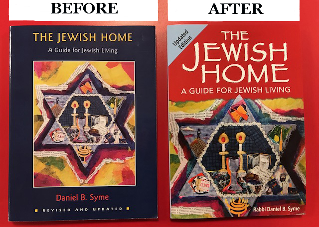
Looking at before and after images of The Jewish Home, talk about how design affects style and tone. What does the "before" cover convey, and what feeling does the “after” image convey?
The before cover, is, well, boring. Everything is centered right down the middle, which is a very old-fashioned choice. The art is not used effectively, because it is surrounded by a navy blue (also boring!) that contains it. The font choices are dull—nothing to catch the eye, and the title is small—almost the same size as the author credit.
The after cover: It adds dynamism by having the type of the title arranged slightly asymetrically. It uses the art far more effectively by zooming in on it so you can see its rich textured details, and has it bleed off the sides, so that it gives the impression that this art is so exciting that it can’t be contained. The torn edge of the art gives a sense of the spontaneous, as opposed to the straight white ruled line in the original cover. And such a great font choice! The new one has a sense of the traditional but is still modern and eye-catching. Plus, the title is given much more real estate, so that readers can find it instantly.
How is designing a cover from scratch different than redesigning a cover to an already-existing book?
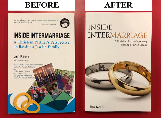
With an already existing book, you might have elements that you can pull and use in the new cover: For example, the great artwork from The Jewish Home. But sometimes, it’s just like starting from scratch, as in the case of Inside Intermarriage, and you just have to start brainstorming.
Anything else you want to add about cover design.
It’s fun! It’s a visual challenge. So much work is done on the interior of the book—but without a great cover, no one is going to crack it open and discover that treasure.